

Fields
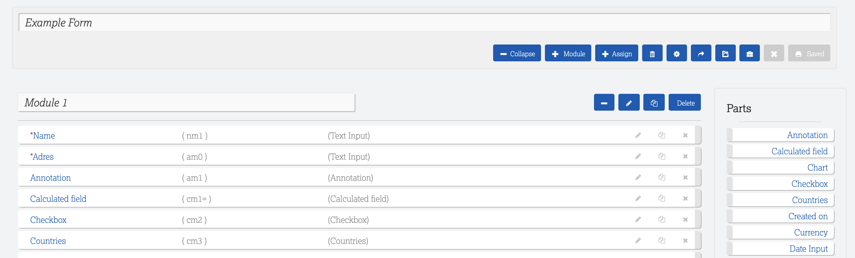
You can add fields to your Modules by dragging the required field from the menu on the right onto your form.
For example, use "text input" for a name field
Be very carefull when selecting how to set up your fields. If you want to make transformations it is easier if fields you want to copy are the same in your source as well as the destination.
- In the next screen fill in all the necessary details.
- Give your field a name - this will be displayed as the field name on your form
Enter the following options where applicable
- Minimum length
- Maximun length
- Default value
- You can fill in an Explanation (tooltip) for most fields - this will be visible as a ? next to your field
- You can indicate if it is a regex field (regular expressions to verify a postal code for example)
- Visible - with this option you can indicate that a field becomes visible once a certain condition is met in a previous field. You fill in a formula, if the formula is true then the field will become visible.
- Placeholder - You can add a placeholder to a field as example of what / how information should be filled in.
- Apply the neccessary settings to the field:
- Required - this makes the field mandatory
- Searchable - adds this field to the search box on the specific Form overview
- Show in search results - shows this field in the search results overview at the bottom of the specific form overview
- Answer in api search
- Show in Boost form overview - shows the field on the form. To hide a field when you do not use it anymore then uncheck this box (do not delete the field).
- Show in children overview - show the specific field in the linked child view
- Key - makes the field usable to identify a form and relate forms to each other. This is necessary when making transformations
- Unique - the field will contain only unique values
A reference of all the different fields and their options
- Annotation - Use this field to add an explanation of what is required in a specific field/module.
- Calculated field - Add a formula using the field id's to make a calculation (Formula precision, round, )
- Checkbox - To create a list with checkboxes from which to choose. Use this when you can choose multiple options - Items (Value)
- Countries
- Created on - Pattern, Show time
- Currency - Choose what format your currency is in, eg. EUR, USD
- Date input - Pattern, Show time
- Dropdown - Items (Vaule can be filled)
- Edited on - Pattern, Show time
- Fee input - Used for amounts - Bedrag Pecision, Round
- File - To be able to upload a file,
- IDEAL field - Amount part (reference field?) Success URL, Failure URL, Description, Default value, om betaal link te genereren
- Image - ,
- Location - ,
- Number input - , Precision, Round, ,
- Password input - This can be necessary to link to other systems for eg. a Bookkeeping system
- Percentage Input - Precision, ,
- Phone -
- Radio button - To create a list with buttons from which to choose. Use this when you want to limit the options to one choice.
- Rating - View type, Items (values can be filled),
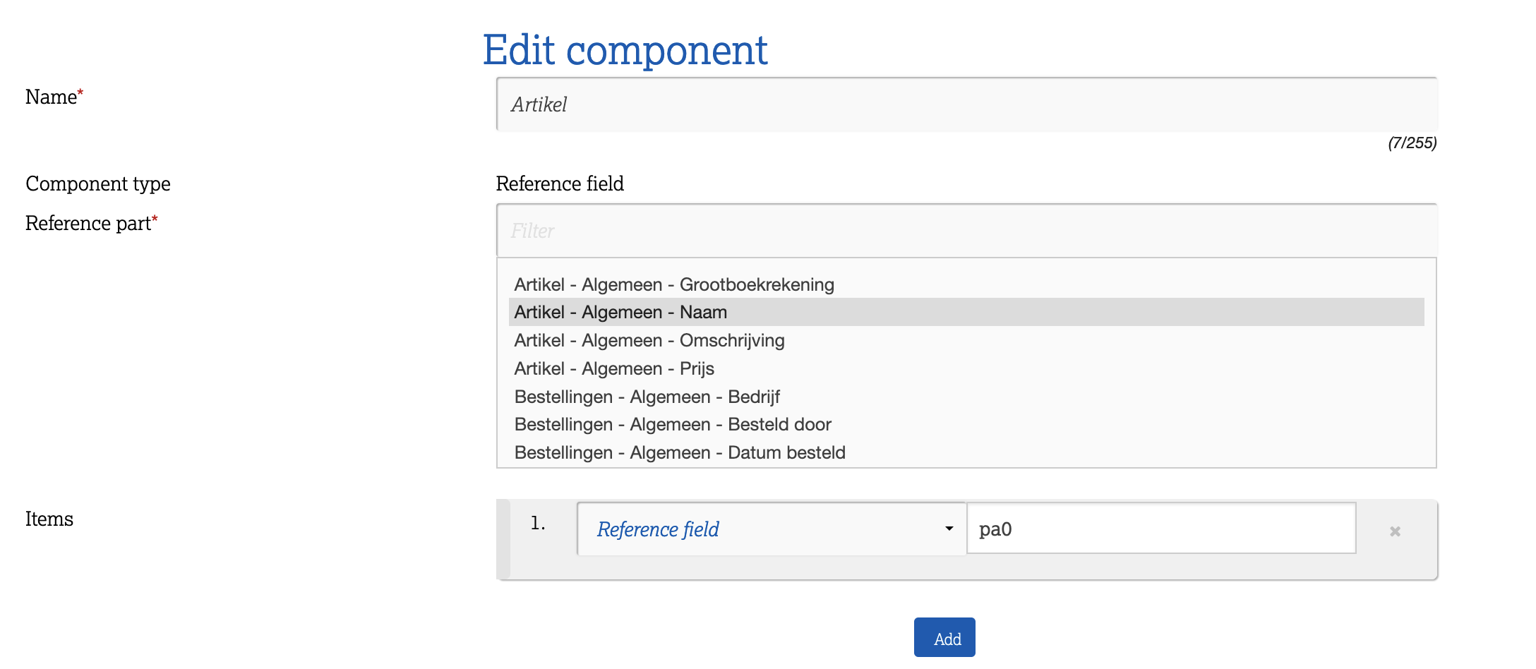
- Reference field
- Create a field to reference a field on another form, eg. Client name on invoice; Reference part (reference field) Use in RLS
- When you reference a field it is also possible to add another field automatically, for example when you choose an article the price will be added automatically
- In Reference part choose the field you want to choose from in your new Form, eg Artical name
- In the Item field choose the other field you want to fill automatially (eg. Price) and in the variable box enter the code of the coinsiding field of your source document
- Sequence number - Prefixes, Start number, ,
- Signature field - Success URL, Reference part,
- Static text -
- Text area - A bigger text box for eg. to fill in a description
- Text Input - A small text box for eg. a name - Regex - Verschil tussen text area and text input
- URL - ,
- WYSIWIG - Text block with formatting options